Earthly
Tools
My Contribution
Method Employed
Heuristic Evaluation,
Face-to-Face,
Remote Usability Testing
Face-to-face usability testing, Remote Usability Testing, Heuristic Evaluation, Think Aloud method
Summary
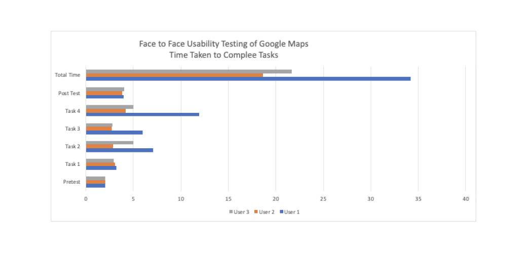
The usability testing of the current version of Google Maps (March 2020) was conducted by 4 Rutgers University – School of Graduate Studies evaluators in March 2020. This usability study adopted the Think Aloud method (Nielsen, 2012), a common method that asks testers to speak aloud their tasks while performing to help evaluators gain insights into the usability of interfaces and testers’ pain points.
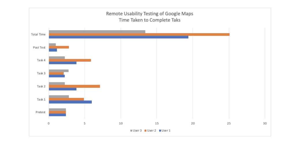
In stage 2, our team used Usertesting.com to conduct remote remote unmoderated usability test to gather findings of qualitative and quantitative data based on the findings that we highlighted in face to face usability testing.
These two tests enabled each evaluator to conduct both face-to-face test and remote usability testing independently to examine the usability of Google Maps.
Time: March 2020
Deliverables: Usability testing reports, user testing script, Webex
Method Employed: Face to face usability testing, Think Aloud method, severity rating, remote usability testing
Usability Testing Process
Overview:
A total number of 6 people, who were recruited by Usertesting.com participated in our usability test. All of the participants are demographically diverse and are somewhat familiar with Google Maps. The three participants’ ages from the group test range from 25 to 60 years old. The three participants’ ages from my test range from 18 to 25 years old.
A total number of 5 people, who were recruited by course instructors, participated in our usability test. All of the participants are demographically diverse and are all somewhat familiar with Google Maps. The features that have been used the most are location services, such as navigation and finding locations. All 5 participants prefer the mobile version over the desktop version.
Although participants were given unlimited time to complete the task, we found out that the younger group tended to complete the task faster than the older group.
Goals:
To gather the findings of qualitative and quantitate data based on face to face testing and remote testing
To gather the findings of qualitative and quantitate data based on face to face testing and remote testing
To find the shortcomings of Google Maps’ interface by observing participants’ performance and their interactions.
Testing & Findings
Based on our face-to-face and remote usability testing, I highlighted 2 usability problems that are considered as Level 3 - major usability problem and Level 2 - minor usability problem, according to Severity rating (Nielsen, 1994).
Each participant was giving the following tasks:
a. Get directions to Rockefeller Center
b. Find directions to Rockefeller center without paying tolls (except tunnel)Look for parking near
c. Rockefeller CenterTry to buy tickets for Top of the Rock
Face-to-Face Test Findings:
1. Hiding information in the “OPTIONS” panel task
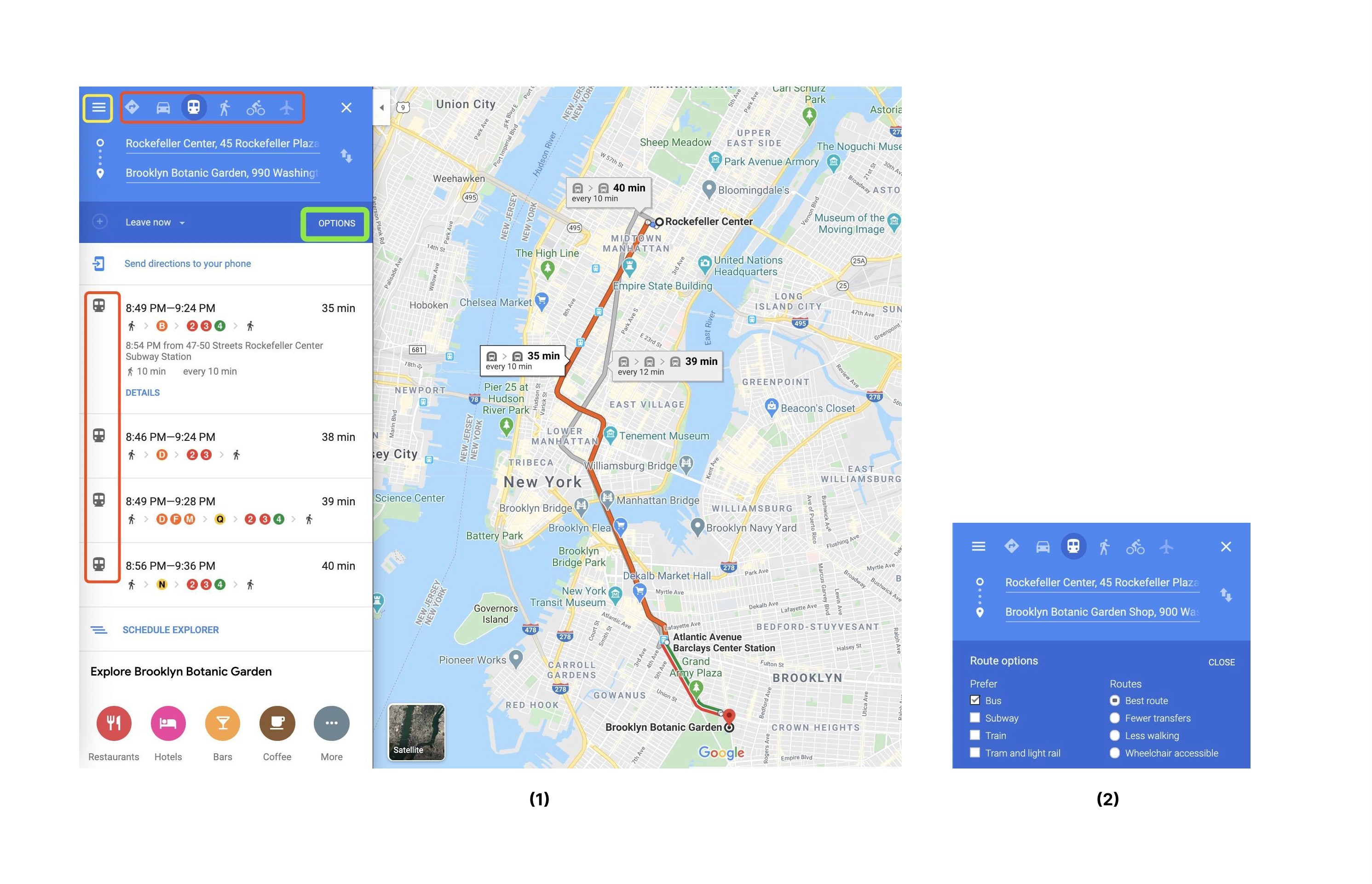
This interface indicates that users have difficulty finding the way from Rockefeller Center to Brooklyn Botanic Garden via bus
“ ...“OPTIONS" is too general, they are missing the box... Once I saw these(icons), I'm looking for the box (for bus). In this case, they hind in the "OPTIONS". I like it because I don't have to open up a new window and search outside of it… there are different options right away that I can see…
Participant 1
Rating 3: The “OPTIONS” panel has a major problem because it does not explicitly identify (self-explained) its function.
Problems: Participants tend to omit the “OPTIONS” panel when they are asked to find the direction from Rockefeller Center to Brooklyn Botanic Garden via bus. The top 6 transportation icons gave participants a mindset that they should have a bus icon. In addition, most participants were distracted by the hamburger menu (highlighted in yellow) and show signs of losing patience when they had a hard time finding the bus option. Overall, the average time that participants spend on this task was longer than any other task.
Recommendation: Since “bus” is the only transportation choice that is not included in the top menu(see figure 2), it is necessary to incorporate a bus icon and make a hover effect on the “OPTIONS” panel to briefly explain the feature in order to reduce the confusion and user frustration.
2. Unclear instruction
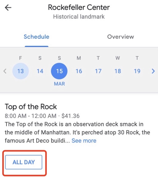
This interface indicates the ticket purchase interface for Top of the Rock.
"I like it because I don't have to open up a new window and search outside of it… there are different options right away that I can see… I guess you can go anytime… but it is not clear to me the difference between them… so I think I have to click each one to get some information "
Participant 2
Rating 2: The “ALL DAY” button has a major problem because it does not explain what it means, even when users clicked “See more”.
Problems: When participants were told to buy a ticket for Top of the Rock, they were confused about this “ALL DAY” ticket. Therefore, participants have to click “see more” and read through long paragraphs to verify the meaning.
Recommendation: It is necessary to add a self-explanatory sentence under the “ALL DAY” ticket to inform users of ticket instructions, rather than hide the information in large paragraphs.
Remote Test Finding: Lack of self-descriptiveness
Each participant was giving the following tasks:
Now you would like to visit The Metropolitan Museum of Art the after Top of the Rock. You see a notification that the subway line is down all across the city and taking a taxi would cost too much, so you want to get there by bus. How would you plan this out?
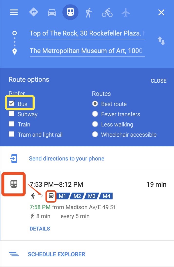
This interface shows that users are not able to distinguish whether the transportation method is “subway” or “bus”.
Rating 3: It is a major problem because participants were not able to figure out which transportation is shown.
Problems: The inconsistency between these two icons confused all three participants. Once users expanded the “OPTION” panel and filtered “bus”, the larger subway icon on the right seemed to inform participants that the transportation they filtered was subway instead of buses. However, the smaller bus icon next to “M1/M2/M3” perplexed participants whether or not it is “subway” or “bus”.
Recommendation: Keep the consistency between selections and icons. In this case, if users only selected “bus”, the bigger icon should also be the same as the small icon. Additionally, adding a heading below the big icon will also help users to better understand the transportation icon.
Outcomes
Based on our usability testing, the major problem determined from our test are mainly due to the lack of self-descriptiveness.
Participants who are familiar with Google Maps tend to complete tasks faster and make fewer mistakes than those who are not familiar with the product.
In the post-test question, all 6 remote testing participants said they would like to recommend Google Maps to their friends and would like to use it for more than just the basic functions such as in finding directions and navigation.
There is no need to redo interfaces from scratch. All issues are relatively easy to fix under collaboration with designers and engineers.
Reflections
It is clear to us that Google Maps would like to be a ‘one-stop-shop’ for all things travel related and in many ways, it is. It provides users with advanced capabilities, such as making reservations at restaurants, planning and sharing trip itinerary, and buying tickets to events right through the app’s interface. It also covers the basics from finding different ways to get from point A to point B
At the end of the day, there will never be a one-size-fits-all solution that meets every need out there. However, we believe that although there are minor imperfections, Google Maps as a solid product. The data we’ve collected tells a valuable story about the things users appreciate as well as the common mishaps that occur while using this product.
Our group believes that none of these issues are severe enough to cause a catastrophe. However, the experience of conducting heuristic evaluation, face-to-face and remote usability tests all proved to highlight some notable issues and showed us how even a product that is used by millions everyday can still have room for improvement.